Friday, 30 August 2013
R&P World War Z Trailer Analysis
The main character in the film, "Gerry" played by Brad Pitt with appearances from Mireille Enos and Daniella Kertesz playing the other main characters in the film. The main character being played by Brad Pitt is one of the main appealing factors of the film as Brad Pitt is a respected actor who has appeared in many good films such as Fight Club and Ocean's Thirteen. This will help to attract an audiecne as Brad Pitts reputation as an action is indisputable
The plot is based around a contagious infection sweeping though the city of New York turning ordinary people into flesh eating zombies, it is the job of Gerry Lane to keep his family safe from the vicious zombies, and although it is not made clear in the trailer, i would assume that Gerry will have something to do with stopping the crisis. This is a typical plot of an action/horror film where something catastrophic happens and the hero has to save the world and their family. This follows Todorov's narative theory closely, there is a disruption of the equilibrium at the start of the film (the infection breaking out and zombies reeking havoc) and its the role of the main character to stop the crisis. The plot also vaigly conforms to Propp's theory. There is a clearly defined hero, Gerry, and there is the princess, The family of Gerry, and no doubt there will be a villan and a helper, although it is not shown in the trailer, but we can assume this will happen though out the film. The plot does not completely conform to Propp's theory, but it is close enough to say it resembles the theory.
The setting of the trailer changes throughout the trailer, it start off in the streets of New York in a massive traffic jam, which is not uncommon in New York, which helps to make the audience feel calm and doesn't send any alarm bells ringing. The setting then changes to a street full of people freaking out which immediately grabs the audiences attention and makes them want to continue to watch. The trailer then flashes though different post apocalyptic scenes of the city as well as some shots of military personnel and helicopters.This helps to raise the tempo of the trailer making it more engaging to the audience.
The costumes of the cast are the kind of thing that the normal civilian living in New York and other character have different designs depending on their role in the film, whether that be a military officer or a zombie, they all have conforming designs of costumes.
The sound track that is featured in the trailer is varied between non at the start, and a heavy distorted metal sounding guitar that starts in the middle of the trailer and continues to the end. This use of music helps to make the beginning of the trailer seem almost plain and boring and the music that starts half way though the trailer makes it seem really high paced and action packed.
Wednesday, 28 August 2013
R&P Captain America Empire Magazine Cover Analysis

The cover of the magazine features the main character, Captain America obviously, played by Chris Evans. On the cover he is seen wearing the famous Captain America uniform which has become a very recognisaly icon in the comiv book world. By doing this one simple act, the studio have managed to make the main character stand out to the reader of the magazine, or even someone that catches a glimps of the cover out of the corner of their eye as the are walking past it in the shop, this makes for good advertising as it helps the audience identify the character featured in the image any maybe even want to read more about the film, by buying the magazine.
The costume is very icon, even to those that have not even heard of Captain America, this is beacuse of the colours that are within it. The colours are white, red and blue, and unless you have been living under a rock all your life, you would know that those are the colours of the american flag. As the film is an american made film, it would not be unexpected of much of the audience went to see the film just becasue of the name, Captain america, or the colors. Fortunately for the studio, the costume did not have to be altered to achive this as the original captain america from the original comic wore the same colors. The apperance of the coulors is also very eye catching. The red is a very deep dark red while the white and blue are of a lighter shade. This helps to make the image eye catching as the contrast between the colours is very apparent.
Just the way in which the character is standing makes the audience feel that the character has some kind of power has dominence over other people. This is also a good way in which the picture helps to establish the genre of the film, in this case it is an action film, the character also helps the film appeal to a wide range of audiences.
The title is placed about two thirds of the way down the page, which makes it very eye catching, not only does the positioning of the title make it eye catching, but the size, font and the colour of it also help. The font is quite large, with the text covering most of the page horizontally, which makes the text unaviodable so to speak. The font resembles the font used in the "Empire" title at the top of the page which helps to make the cover look clean an appealing. The colour of the title is in white, no doubt done to match the colours of the American flag, not just to make the title easy to see. This not only makes the title look nice, but also helps it to relate with the time of film that it is associated with.
The American flag is also featured in the background of the image which is appropriate of the film in which the cover of the magazine is advertising, but a side benfit of the flag is that is is very eye catching.
Under the main movie title is a little sub heading "How summers biggest superhero went to way". This is a nice little touch that gives the cover a bit more sustenance, even if it doensnt really add anything... apart from "Summers biggest superhero", which could be taken by the audience as this film is the best super hero film of the year, which may make more people go and see the film.
The cover has a very clean layout, which makes it easy for the audience to pick out the most important parts, which are the title of the film and the main charcter that is featured in the cover. The main character of the film is the main focus on the front cover, which is good from an advertising stand point, but also a good way for Empire to make their magazine more appealing.
R&P Transformers 3 Empire Magazine Cover Analysis

The main image featured on the front cover of this edition of Empire is two of the character from Transformers 3 film, Sentinel Prime and the all-new Optimus Prime. The names of the characters are even identified of the front of the magazine in small white text next to their pictures, the text is small in order to avoid intruding into the image, ruining the look.
The main characters featured on the cover of the magazine are seen holding a gun and and a sword, and if that isn't enough to make you see that the film is an action film, a massive explosion has been adding into the background, just for good measure. It is clear that the design of the image has been done that way it has to make the genre of the film very easy to identify.
Like almost all adverting images, the colours of the characters is very bright with a high contrast between the lightest and darkest colors, this helps to make the image very eye catching to the audience. The colours of the characters are all blue and red, which in themselves are bright colours, but the editing done to the colours in the image make them even more vibrant. The explosion that can be seen happening in the background of the image is also in colours that stand out, not only from the background image, but also from the characters in the foreground. The colour of the explosion is very bright orange, which like the colours found on the main character in the image, is very bright by itself, but as there is an obstruction in the way of the explosion, the colours have to been even more bright and vibrant, which has been done in this cover image, The colour of the chacters and the colour of the explosion contrast well making them both stand out.
As i have already stated, the genre of the film is identified early on as an action film, however the cover image makes this REALLY clear to the audience, which helps to attract an audience, especially the younger audience, as (without stereotyping) young people tend to like explosions and fights, and with that explosion in the background, this film is irresistible to younger people, and that's without even mentioning who/what the characters are... BIG FIGHTING ROBOTS FROM SPACE, what could make an action film more appealing?
Unlike most of the Empire front covers, the featured image only takes up about half of the page, whereas most of the time the features images are full page size. This does not mean that the image is not eye catching to the audience or a good piece of advertising, but it does raise questions as to why it is not a full page image.
The title of the film is also not located in the conventional place, it is located above the Empire title, which is different as it is usually located in the middle of the page. This actually makes the title less eye catching as it is smaller and further away from the main characters in the image. The colours of the title are also different, one section is black whereas the rest is in white, now whether this was done to make the text easier to read or whether it was done for a different reason , but as far as i can tell, it makes it less eye catching and less clean looking. The rest of the cover though has a very clean look which is common for empire covers, so i guess that could make up for the shortfalls in the rest of the cover.
R&P Mission Impossible 4 Empire Magazine Cover Analysis

The cover of this edition of empire magazine showcases the main character Ethan Hunt played by Tom Cruise with Jane Carter played by Paula Patton, Benji Dunn played by Simon Pegg and William Brandt played by Jeremy Renner feature in the background of the image. These are the main characters of the film and most of them heave appeared in the previous films at some point. Featuring the main characters in the front cover of the magazine helps to atteract the audicnes attention as the characters, especially Tom Cruise have a huge fan base and by putting him on the front cover, they are appealing to an audience that includes fans of action films, spy films, sci-fi films and fans of Tom Cruise.
The genre is a bit harder to identify from the offset in this cover image as some of the other civer images i have seen, there is nothing really that gives away the genre, other that the title, but for those that are not familiar with the Mission Impossible franchise, it might be a little tricky for them to identify the genre of the film that they are advertising, but there are a few hints in the image as to what the genre could be.
The characters are all wearing black with Ethan wearing the iconic black leather jacket. This could be something that could help the audience identify the genre as well as the futuristic background. It is a very dark image overall with very few objects in the background. The rest of the characters as well are wearing darker clothes, mostly black with also helps to give the image a darker and more mysterious feeling, even though the genre of the film is an action film, but the mysterious feeling of the image makes it more interesting to the viewer, as well as helps the advertising of the film.
The title of the film is shown in white text in almost the center of the page, which is the second thing that the audience audience will see after the main image in the center of the page, The white text makes the title pop out of the page, especially against the white background, the white text also makes the page look really clean, which makes it more appealing to the audience. The font of the title is similar to the Empire title at the top of the page, this keeps the page tidy and appealing to the eye.
There is not much else in the image on the cover of this edition of Empire magazine, the image is simple yet effective.
R&P Skyfall Empire Magazine Cover Analysis

The main image on this Empire magazine features the main character, James Bond, played by Daniel Craig. He is in the typically icon James Bond black suit. James Bond is a very iconic character in the film world and using him on the front cover of the magazine is bound to attract some attention. As James Bond is such an iconic character in the film world, putting him on the cover of the magazine rather than another character will help to attract the audiences attention. The black suit that the character is wearing also helps to make him stick out from the background, the contrast of the suit from the white/grey colour background makes the character really stick out, making the audiences attention be attracted to the image.
Going into more detail about the characters costume, he is wearing a black jacket with black trousers, the jacket being worn on top of white long sleeved shirt with a black tie. This is a typical James Bond style of clothing and has been used in almost all of the previous films. The character in the image is holding a gun in his right hand which helps the audience to identify the genre of the film, if they did not know already and or haven't seen the other James Bond films that came before. By making the films genre really easy to identify, they have opened up the possible audience to not only fans of the James Bond franchise, but to those who are a fan of the action spy genre.
In the "foreground" of the image we can see what looks to be bullet holes in an imaginary glass covering of the magazine. The bullet holes are located on the left shoulder and the right elbow of the character. It is obvious that the design of the magazine cover has been done to insure that the face of the character is not covered by the bullet holes. This not only gives the cover more sustenance and makes the image more appealing to the audience, but it also helps the audience to identify the genre of the film, which as said before, helps the film attract a larger audience.
The title of the film is located in the bottom half of the image around the characters waist, and like almost all of the other Empire magazine covers, the title is in white and in a pain font similar to that used in the Empire title. This makes the name of the film stand out, especially against the balck suit if James Bond. Just under the main Skyfall title, we can see the words "BOND. BACK IN BUSINESS". This is a reference to the other James Bond films that have been made in the past, and that perhaps Skyfall will just as action packed as the other James Bond films have been in the past.
Under the title and the sub title, we can see the pictures and the names of the other James Bonds from films that have been and gone in the past. This also helps the audience to identify the franchise and the genre of the film.
The background of the image has a very clean look and it helps to make the character stick out, and give him huge dominance over the rest of the item on the cover of the magazine. There are a couple of other films being featured in the background of the cover, but James Bond is much more prevalent in the image.
R&P Bat Man the Dark Knight Rises Empire Magazine Cover Analysis

The main character featured in the "Dark Knight Rises" cover of this edition of Empire Magazine is of course, Batman, the main hero in the film and all the comics before from where he originates from. This helps the audience to immediately identify the film, even without looking at the title of the film.
The main character can be seen in the image wearing the icon Batman outfit and is holding some sort of technologically advanced weapon, most likely a rocket launcher. Weapons and furturisit gadget have become an icon of Batman, as he doesnt have any powers like almost all of the other super hero's, but needless to say, he popularity in the world of super hero's is undeniable. Batman has a huge fan base and anyone that did not know the genre of the film, or what the film is about are few and far between, even those that are not huge fans of the franchise still know who Batman is and what he does. If for some reason a member of the audience did not know what batman is or what genre the film is, the large weapon over Batman's right shoulder is sure to make them realize that this is an action film.
The main character in the image, Batman, is wearing the standard batman outfit and mask, this is not surprise as its the most iconic thing about batman. The background of the image however is different than most of the other Empire cover images. The background image is just plain black image with some kind of lense flair radiating around Batman. The lense flair illuminates Batman so that the audicne can see the character clearly, as the background is the same colour as the character.
The title of the film is in white, which makes it very visible to the audience and makes it stand out from the rest of the image. The positioning of the name of the film however is alot different that that from alot of other Empire covers. This one is located in the bottom left of the cover, but most of the titles on the empire covers are located close to the middle on the vertical center line. This does have an impact on the cover as the title is not as in-your-face as the other where it is located in the middle of the page, but that does not mean that the title is not visible to the audience, because it is. The font used is the same as that used for most of the Empire covers and is similar to the font used in the Empire title at the top of the page. This helps to keep the page looking clean and appealing.
Other than the main image and title, there is not really much else in on the cover of the magazine, this helps to attract the audicnes attention to the main image and the main name of the film, which is what you want if you are advertising a film.
R&P Rocky Poster Analysis
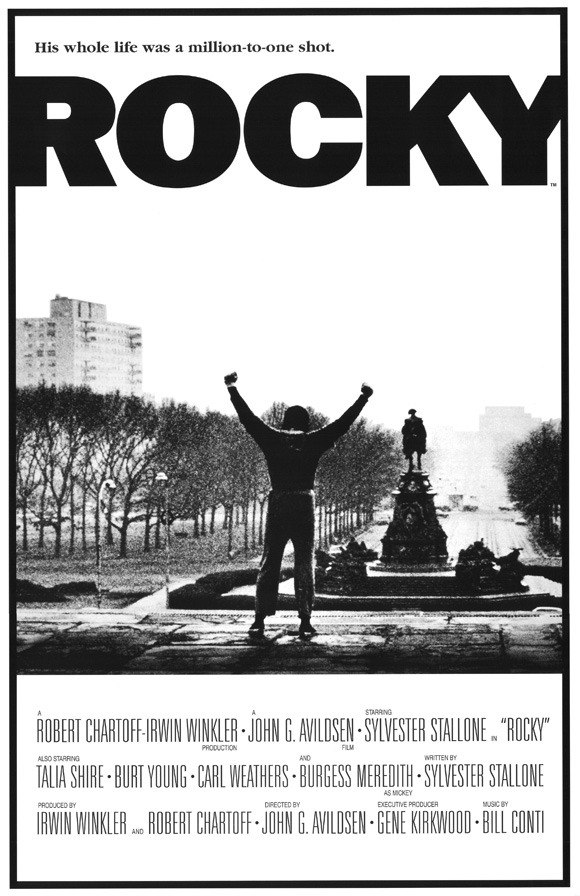
The Rocky poster features the main character " Rocky Balboa" in one of the most icon moments in the film, where he is standing on the top of the stair that he has just run up with his hands in the air. Even though the poster would have been released before the film, and the audience would not know what this scene is, it is still a good image that represents triumph and glory, of which the film is all about.
The poster is in black and white, even though the film is in colour. This may have been done to conform to the time era of which the film is set, the black and white also gives the poster a retro feel. The black and white design is also different to most of the other poster of the time and would have helped to make the rocky poster unique and eye catching, which would help to attract an audience.
Just from looking at the poster, it is hard to identify the genre of the film, there are no tell tale signs that give away the genre like in many other posters, but i guess that by making the genre hard to identify, it makes the audience more curious as to what the film is about.
The main title of the film is located at the top of the page along with a small slogan. The font of the title is very plain and the text is in bold black. The contrast between the font colour and the background colour really makes the title stand out and gives it a real in your face feel, which is good as it attracts the audiences attention.
The film is set in downtown Philadelphia in 1975 and in the background of the poster, you can see the city streets of downtown with the furthest buildings fading away into the distance, in the foreground, you can see the main character with his back facing the camera, which helps to keep the audience guessing who the main character is played by, that is until they look at the bottom of the poster where the credits are located.
Finally at the bottom of the page we can see the credit information. This section of the poster is separated from the rest of the poster by a dividing line where the picture and the credit information are split, this helps the audience to differentiate between the picture and the credits as well as making the credits clearer. The credits are surprising large for a poster, especially compared to more modern posters, some may argue that having large credits is a good thing, others would argue that they are a bad thing and that the ruin the look of a poster. What is strange about this poster is that there are no dates on the poster, i assume that this poster is a marketing poster released before the date of the film was finalized.
R&P Reservoir Dogs Poster Analysis
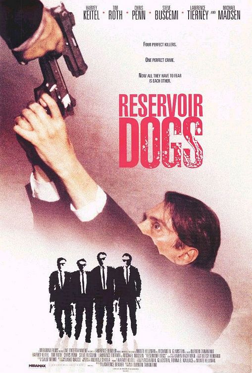
The poster for reservoir dogs features a character in the middle of the poster with a gun being pointed at his head
The characters themselves can been see wearing black suits, in fact they are all wearing the same suitm, which could mean that they belong to some sort of organisation. The black suit is also something commonly found in gangster films. The suits that the characters are wearing not only stand out from the white background, but they also provide the audience with an insight into what the genre of the film could be.
R&P Pacific Rim Poster Analysis
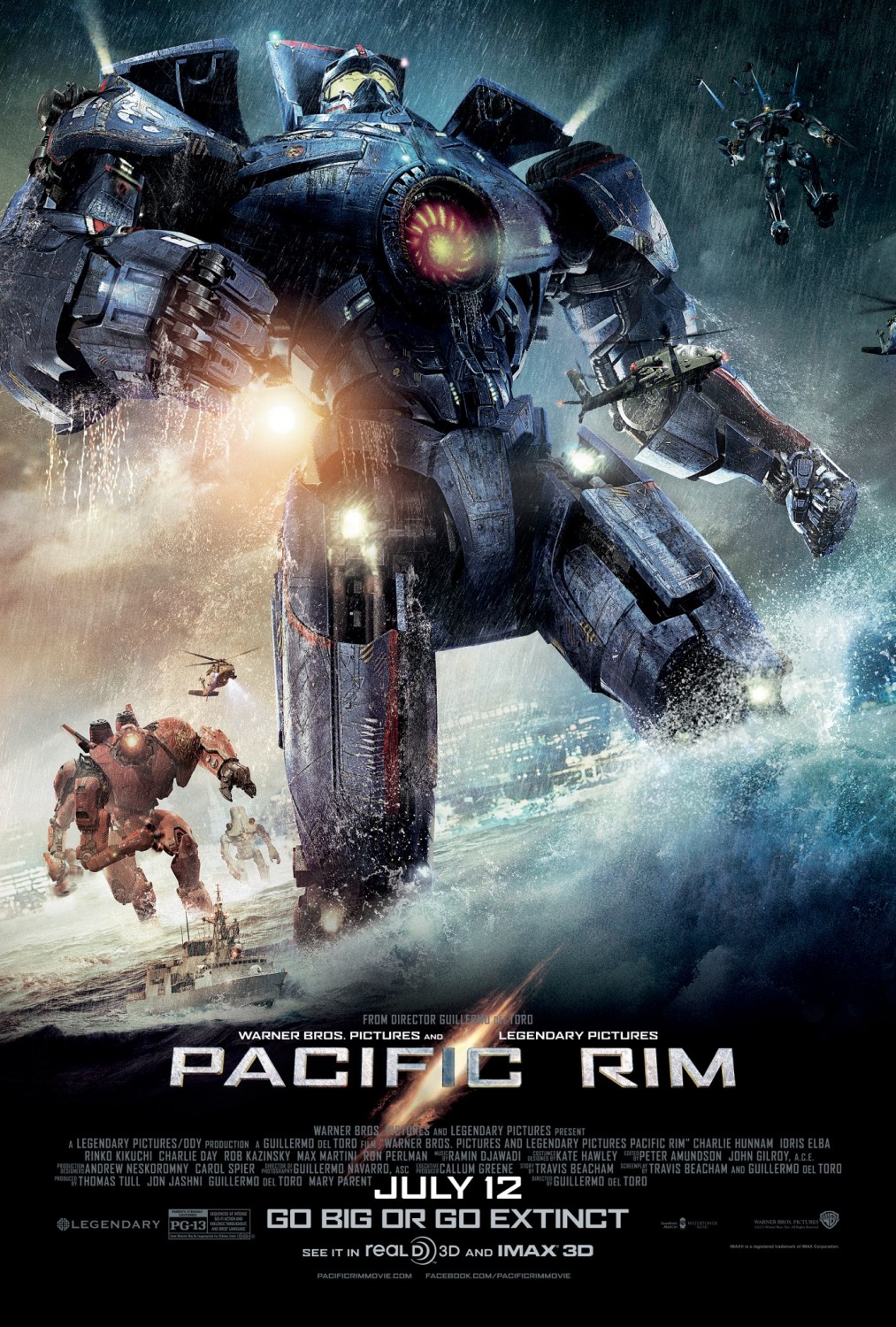
The poster features the main Jager from the film, "Gypsy Danger" in the middle of the poster, with some of the other Jager's in the background of the poster. The main "character" in stading in water with a big wave crashing up against their leg.
The poster has a lot of bold colours of which are really eye catching to the audience. The poster has obviously been designed to show off the incredible CGI used in the film, and it has done that. The unique selling point of the film is the CGI that is used in it, and by using the CGI images in the poster it not only makes the unique selling point of the film obvious, but it also makes the poster more appealing to a wider audiences.
From looking at the poster, the genre is obviously action. The massive robots and the helicopters in the background give the poster a military feel, even though there is no direct references to the military, such as army soldiers, tanks, or missiles and jets. Action is a really popular genre of film and is bound to attract a big audience.
The main title of the film is located at the bottom of the page and is presented in capitals throughout the title. The title is in a white/silver colour and really stands out from the dark blue/black background it is up against. This helps to make the title of the film really stand out to the audience and will be the second thing that there attention is focused on after the main image in the middle of the poster. The contrast of colours between the title and the background really make the title visible. Just behind the title text is an orange "tear" in the page, which may have something to do with the plot of the film. Whether that tear is there for a plot reason or just to make the title look better, it does make the title look better non the less, which also helps to make the poster look more attractive to the audience.
At the bottom of the poster we can see the institutional information and the release date. The release date is in a white text which helps it to stand out from the dark coloured image behind it. This means that the release date of the film is really clear to the audience, hopefully making them more likely to go and see the film at the cinema. The institutional information however is really small and in a darker colour font making it blend into the background image a lot. This is most likely done because the audience does not really care about the company that makes the film, as long is the film is good, so by making that information smaller and blend into the poster more, they can make the poster look more clean and give the audience the information that they want, whilst still giving credit to the people that worked hard on making the film.
R&P Django Unchained Poster Analysis

The poster features the main character of the film, "Django" in the middle of the poster, with the other main character to the left and right of him.
The poster has an interesting design, with the characters being in black and white, and the rest of the poster in colour, mostly red however. This has the effect of making the titles stand out, rather than the character in the poster, however the characters in the middle of the poster are still the center of attention. The character being in black and white may also give the audience an idea of the time era the film is set in. The blood that is splattered behind the main character but in front of the other characters is in colour unlike the actual characters. This helps to attract the audiences attention as well as give an indication of the genre of the film and what the film will include, but after seeing that it is directed by Tarantino, you can be sure that there will be lots of blood and violence.
The characters are wearing really stereotypical western/cowboy costumes and are holding a revolver, as well as sporting cowboy hats. Not only does this make the poster more appealing to the audience, it also helps to identify the genre of the film.
The film is obviously a spaghetti western, the poster just screams it, everything from the characters and what they are wearing, to the art style and the blood all over the place is a clear indication of the genre.
The title of the film is located just down from the center of the page and is in a western style font and is in a bright red colour. The title is very eye catching, especially up against the black and white image of the characters, one could even say that it is more eye catching than the image of the characters themeselves, which is strange for a film poster. The main title of the film is not the only text that is visible on the page, there is also the credits for the actors that are located above the main film title almost in the middle of the page; which are writen in the same style as the main title text but in a white colour, as well as the credit for the director, Tarantino. There is also some text under the main film title with is mostly comprised of the institutional information. The information, other that a few other actor credits, which are white, just like the other actor credits, are in a grey colour. This enables the designers of the poster to make that information blend into the page, the same thing that is done in most other film posters. The audience does not want to see the institutional information, so why should they, so that information is hidden at the bottom of the page in a font and colour that is not bold or eye catching. Lastly, at the bottom of the page we can see the release date information, which is in the same colour and font as the title of the film only smaller. This helps to make it stand out and give the audience the information that they want.

Saturday, 17 August 2013
R&P "The Hobbit" Poster analysis
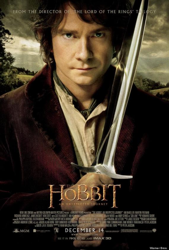
The poster "The Hobbit" features the main character of the film, Bilbo Baggins played by Martin Freeman. This is a different advertising approach to the Empire magazine cover as the poster features an actor that was not in the Lord of the Rings trilogy of film, this might mean that the average film watcher may not know who the character featured in the poster is, however the art style and the colours in the featured image are highly similar to the art style used in the original three films, with the colours on the character in the foreground being very bold and the overall contrast of the image being very high, and the background colours being very washed out and aged looking, this makes the character in the foreground stand out and making it the first thing the viewer looks at. The character himself is holding a sword, indicating to the viewer of the poster that the film is set in a time before guns and bombs, aka middle earth where the film is set.
The next thing that the audiences eye is drawn to is the "The Hobbit" title placed in the middle of the page close to the bottom of the poster. The title is in the same colour and font as the original three films, which means that people that have seen the other three films will know that the film is part of the series. The other reason why the title is effective is because it is eye catching, it is the second thing the audiences attention is drawn to after the main image, which is obviously intentionally done by the studio.
In the background of the image you scan see that there is a visible reference to the setting of the film, which is one of the USP of the film. it is filmed in the hills of the New Zealand and is has some of the best scenery seen on modern films. The landscape is visible in the background behind the main character depicted in the foreground. You can see the light beams going though the clouds onto the ground behind the main character.
The industry information at the bottom of the page is in a white text against a mostly black background. This helps to make the text visible, but not intrusive.
Subscribe to:
Posts (Atom)