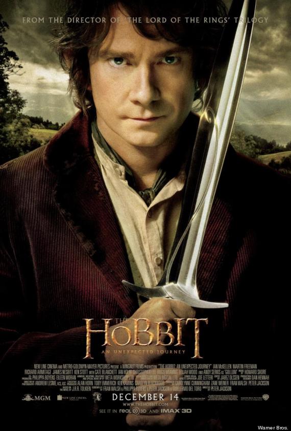
The poster "The Hobbit" features the main character of the film, Bilbo Baggins played by Martin Freeman. This is a different advertising approach to the Empire magazine cover as the poster features an actor that was not in the Lord of the Rings trilogy of film, this might mean that the average film watcher may not know who the character featured in the poster is, however the art style and the colours in the featured image are highly similar to the art style used in the original three films, with the colours on the character in the foreground being very bold and the overall contrast of the image being very high, and the background colours being very washed out and aged looking, this makes the character in the foreground stand out and making it the first thing the viewer looks at. The character himself is holding a sword, indicating to the viewer of the poster that the film is set in a time before guns and bombs, aka middle earth where the film is set.
The next thing that the audiences eye is drawn to is the "The Hobbit" title placed in the middle of the page close to the bottom of the poster. The title is in the same colour and font as the original three films, which means that people that have seen the other three films will know that the film is part of the series. The other reason why the title is effective is because it is eye catching, it is the second thing the audiences attention is drawn to after the main image, which is obviously intentionally done by the studio.
In the background of the image you scan see that there is a visible reference to the setting of the film, which is one of the USP of the film. it is filmed in the hills of the New Zealand and is has some of the best scenery seen on modern films. The landscape is visible in the background behind the main character depicted in the foreground. You can see the light beams going though the clouds onto the ground behind the main character.
The industry information at the bottom of the page is in a white text against a mostly black background. This helps to make the text visible, but not intrusive.
No comments:
Post a Comment