Monday 16 December 2013

Film Poster ideas


This poster fromthe film Cloverfield has some of the same things that we would like to include in our film poster. We would like a scenic shot behind the main character, with the character in the foreground. This type of image for the poster would be good as it shows the main aspect of the film, which is the cinematic sceneic shots of the landscape in the film.This type of image would be able to allow the audience to idnetify the genre of the film and what the story could possibly be about, this would help to attract the audience.

Some more example of tyoe of film poster we would like to produce:


Thursday 12 December 2013

Filming diary 3

On the thrid day of filming we went to the last offical location, Weybridge gravel pit. The scenes that we shot the scenes where the protagonist is beaten by the man whi he tries to assasinate and he is left in the industiral site to die, that is where the scene will end. The filming went well however the sun was too low and made some of the shots difficult as the flare on the lens, but we can use that shot as an establishing shot that might work well, even though it was not inteneded.

Things that went well:
-We got most of the shots we wanted to get
-The scene was as good as we had thought from the research we had done

Things that didn't go well:
The sun was too low which meant the shots we could get were limited as we could not shoot towards the sun
There were other people there

Monday 2 December 2013

Filming diary 2

Day 2

We went back to wisley airfield to finish off the shots that we didn't get last time, which didn't take too long as we got most of the shots that we needed last time, there were only a few shots that we needed to get that were missed and some shots that were added in later. The lighting and the time of day was the same as the last day of filming which means that we can use shots from different days in the same sequence. The shots we got are based around the same time as the other shots which means that we are finished completely with the scenic shots are can begin on the other shots, which are the shots before the war and the conflict that the main character gets himself into. Unlike the previous day, the wind was less prominent which means that the shots that we got will not need ADR which will help to take some of the time out of the editing process. As well as the shots at the airfield, we also got some shots in the surrounding field and area, which will help to give the chracter the impression of traveling though the country. The final location was at my house and we got some shots showing the surviour scavenging through the house, the shot ends with the main character having a gun put to his head from behind by the antagonist.

Things that went well:
We got all of the shots that we intened to do which means that the wisly airfield location is no longer needed.

Thursday 28 November 2013

Age Certificates


The U symbol stands for Universal. A U film should be suitable for audiences aged four years and over. However, it is impossible to predict what might upset a particular child, especially at this lower end of the category range.


PG, parental guidence means that anyone can can go and see the film no matter of thier age at the cinema,however parents are expected to make the call wether to let their children view the film.


12A means that anyone aged 12 or over can go and see the film unaccompanied. The A stands for 'accompanied' and 'advisory'. Children younger than 12 may see the film if they are accompanied by an adult (eg someone over the age of 18), who must watch the film with them.


No one under the age of 15 is allowed to see a 15 film at the cemima or buy/rent a 15 rated dvd. 15 rated works are not suitable for children under the age of 15


Films rated 18 are for adults. No-one under 18 is allowed to see an 18 film at the cinema or buy/rent an 18 rated DVD. No 18 rated works are suitable for children

Wednesday 27 November 2013

Additional shot ideas

These shots will be mostly filmed at wisley and will include:

charles_campfire.jpg

A camp fire shot:
This shot will be similar to the one above with the main character in their own next to the fire, this new shot will hopefully help to shows how wide spread the event was and how the character next to the fire is one of only a handful of people that survived. I also feel that this shot will help to keep the pace of the trailer slow at the beginning.


Car lock picking and looting:
This shot will show the main character picking the lock of a car that is abandoned to gain access to the supplies in the car, this is quite a generic shot and has been used in many action films but I think that it will work well in our film to show how desperate supplies are getting and that the characters have to resort to getting anything they can from wherever they can.


The last shot which I could not find a good image as an example for shows the main character reaching in their pocket and pulling out headphones, putting them on and listening to music which the audience will be able to hear. This will show the audience that not only has the event happened recently as the device still has battery, but it will also show that even after such a wide spread event, the characters still like to enjoy pre-apocalypse luxuries, this will also show how modern societies dependence on technology may hinder their survival.

Feedback

Well done on getting your questionnaire done and uploading some location images. However, there are still some key elements of research and planning missing. You must post to your blog more regularly - there has been nothing posted for 9 days. This should be a reflection of the work you are putting in outside of lessons, so at the moment, there is little to demonstrate how far through your project you are. Remember you could also include any online tutorials you have looked at with an explanation of what you have learned from it.

Targets:
Storyboard and animatic - this is now a matter of urgency
Make sure your location shots have explanations as to why you have chosen them, linking to similar locations in other trailers of the same genre.
More detail needed in filming diary, and regularly updated - what did you film? What were the challenges? What went well?

REMEMBER All filming finished by December 20th

Monday 18 November 2013

R&P Locations

Wisley Airfield


This is a good location to choose as it offers a wide expansive landscape that is an old airfield, which means it is the closed we will be able to get to having an abandoned city landscape. The locations also gives a good feel of emptiness and will help to make the characters in the scene look small and vulnerable, which is the feeling that we were going for. Wisley airfield also offers a wide range of shots, for example you have the shots of the airstrip itself as well as some open green field shots which will hopefully give good variation to the trailer. This type of location is common in the genre of film trailer that we are hoping to produce, as well as in many zombie films, such as I Am Legend, this is undoubtedly because it makes the characters within the scene look vulnerable and small, which helps to grip the audience.


Weybridge Gravel Pit


Weybridge gravel pit is another good location for use to use as it offers an old industrial site which is good for our film as it is based after a chemical war, this location offers all the features that we need to make our trailer look good. As the site has been abandoned it means that it is old and rusted as seen in the pictures, this will hopefully mean that we have a good set of scenic shots for the trailer. We plan on filming in this location early in the morning to to give it an even more desolate feel, as well as to avoid the traffic noises from the road near by. Industrial sites in the same genre are also common as it help to allow the audience to understand what has happened in the film if it had not already been disclosed to them in the narrative of the film, however, as our production is just the trailer for a film, it will be a good idea to incorporate some shots that will help the audience to identify what has happened in the film and what the film will be about.


Thursday 14 November 2013

Filming Diary 1

Day 1 of filming

We went down to Wisley airfield to do the first session of filming. We got some establishing shots of the main character in the post apocalyptic setting. We got some good shots of the main character exploring the desolate world after the events. The weather was good other than the wind which made the audio a little muffled which may mean we need to ADR that section of the film. The lighting was perfect and gave the scene a good desolate feel. The clouds stopped the light causing over exposure. The location that we chose was also extremely good and gave the footage the feel that we were hoping for. The location itself was very good for the shots we had intended to get there, however we did not get all the shots that we were hoping for which means we will need to go back there at a later date and get some more of the story based shots as we did not get many of the story shots when we where there due to a lack of time. After getting the rest of the shots at Wisley that we need we plan to go and get some other shots from the other locations mentioned in the location research. Other than the fact we didn't get all of the shots we had intended on getting the filming we did went well.

Things that went well:
We got some good scenery shot that will be placed at the start of the trailer.
The main character is introduced in the shots we obtained.
The location was a good as expected
The light level were perfect for filming

The challenges:
The wind levels on the day of filming were high, meaning that some of the audio in some of the shots is not suitable for use in the trailer
Time constraints meant that we did not get all of the shots that we wanted to get and means we will have to return to the same location to finish filming, however this is not a bad thing as we have come up with a few other shots that would be good at that location and will have to go back anyway to film those.

Screenshots from day 1 of filming:


Wednesday 13 November 2013

Main character bios'

Chris Robinson

Chris will be the main antagonist in the film, having a relatively small part in it Chris will be the unstable  psychopath which leads the main criminal faction within the wasteland. He will essentially be a sardonic mockery of a human being without any real sense of morals. At his side there will be many inferior thugs which can be used as pawns to him. he will wear clothes similar to many other criminals, bad, dirty jeans with a hoody/ T-shirt. All of them in a state of disrepair to give the character a sense of ruggedness. 

The weapon will change depending on the situation, for example if he is performing an execution style shot to the back of the head then he will have a large, eye catching pistol (such as a revolver) whereas if he is in a fight he will use a compact sub machine gun or a similar, more readily available weapon. This variation will accentuate the unpredictability of the character. He will not really have a set objective, he will exist simply to hurt people for fun.


Will is starring as the main character of our film, he will essentially be a normal person, with no special abilities or traits, perhaps a small amount of military training and a natural sense of intellect, but all of his abilities will be within the capabilities of most normal people. He will lead a small group of survivors which will essentially be the "good" faction of the film. His costume will consist of nothing special, basically just military surplus combined with casual clothes, practical but not so much so that he looks like a professional (such as a soldier or police officer) however it will be practical enough that he looks like he knows what he's doing. 

His weapon will be a simple Colt .45 pistol, this is more for dramatic effect than anything else, it looks much better when everyone is fighting with rifles and shotguns while the main character chooses to use a big pistol, this has been shown in many different films and T.V shows (e.g The Walking Dead, Terminator)  His main objective throughout the film will be something that the average person can relate to, such as searching for a member of family or a friend or simply just to survive.


Sunday 3 November 2013

R&P Questionnaire results

How old are you?
This was generally answered with 15-19, which shows that many of the people who answered this questionnaire were part of our target audience.

What film Genre do you generally like?
Action and horror were among the favourites here, this bodes well for us as our film is mainly an action.

How often do you generally watch films?
This was answered primarily with weekly/2-6 days this is a useful insight into the film habits of our target audience.

Have you ever seen a post apocalyptic film?
Many people said no however much less than what I expected, it shows that this kind of film is relatively recognisable

What is your view on the theme of post apocalypse?
Most people seemed to think the post apocalyptic theme was a good concept, which shows there is still much public interest over our type of film

What catches your eye in the trailer of a film?
The general trend for our answers was the effects, actors, amount of action and generally how the entire trailer catches the audience's eye. We will take this into account while making our trailer.


Is there anything that may be in the trailer of a film that may deter you from watching the actual thing?
Many people talked about corny acting, boring/generic scenes, cheesy effects and basically any indicator that the film is generic or dull. This is relatively useful as we have always been trying to aim to make our film one of a kind and interesting from the first look.

R&P Questionnaire

How old are you?

-Under 10
-10-14
-15-19
-20-24
-25-29
-30-34
-35-39
-40 or over

What film Genre do you generally like?

-Action
-Romance
-Comedy
-Adventure
-Sci -Fi
-Fantasy
-Horror
-Other (please specify)

How often do you generally watch films?

-Every day
-Every 2-6 days
-Every week
-Every fortnight
-Every Month
-Every Year
-Never

Have you ever seen a post apocalyptic film?

-Yes
-No

What is your view on the theme of post apocalypse?

-Very good
-Good
-OK
-I don't know
-Bad
-Very Bad

What catches your eye in the trailer of a film?

__________________________________________________________________

Is there anything that may be in the trailer of a film that may deter you from watching the actual thing?

__________________________________________________________________

Friday 25 October 2013

Feedback

Well done; you have acted on my last targets. Your blog is looking detailed in terms of research and you have begun to move on to focus on the planning aspect.

To complete over half term:
Location and actor photos/profiles, along with an explanation as to why they are appropriate for your chosen genre.
Questionnaire (and feedback) about your initial ideas.
Initial animatic storyboard.

Sunday 20 October 2013

R&P Story board

Shot 1: This shot will show an establishing shot of the main character in desolate area where everything has been destroyed (hopefully we will be able to use Wisley airfield for this) The camera will pan around the character and the shot will be a medium shot, the shot will then zoom out into a long shot. There will be no dialogue in this shot however there will be the ambient noise from the scene and some music playing
Shot 2: This shot will be for the title credits which show the producer and director of the film. The music will still be playing and the text will fade in and out.
Shot 3: This shot will show two characters talking before the event that the film is based around takes place. This will help to give the audience a better understanding of the background of the protagonist. The camera will do a shot reverse shot of a close up of the two characters and maybe a few over the shoulder shots mixed in.
Shot 4: This is another credits shot but this time it will show more institutional information rather than credits
Shot 5: These shots will be based after the event has happened. The main character will be looking for food and supplies and will be scavenging through houses and building. This sequence will have varied shot types that will include close up and extreme close up shots of the character as well as some of the props. Once again the music will be playing, but this shot will start a voice over monologue from the main character.
Shot 6: This shot will also show the character scavenging for supplies but this shot will focus on the character rather than the objects they are handling, Once again the music will be playing ad the monologue will continue
Shot 7: This shot will be the first encounter that the main character has with other survivors. The camera will swap between the characters focusing on their faces using shot reverse shot as well as over the shoulder shots. At this shot the monologue will subside and the diagetic sound will be the only audible sound apart from the music that is playing in the background.
Shot 8: This shot will be a plain black screen and the monologue will return for a few seconds, then the the next shot will be shown. The music starts to quieten down in this shot and fades to almost silent.
Shot 9: This will be a sequence of fight scenes that the main character has with other survivors. This sequence will be a series of fast cuts and the music will start again. The shot will mostly consist of close up shots and medium shots to help make the sequence faster.
Shot 10: This shot will be a follow on from the previous and will feature fast moving scenes with the music playing and some dialogue.
Shot 11: This shot will be a scene where the main character is meeting the other groups of survivors and the sequence will include some arguments with the other survivors and disputes between the main character and the other characters.

Monday 14 October 2013

R&P Possible Film Titles

Project: Survival:

Scorched Earth:

Airstrip One:

End Game:

Her Majesty's Wasteland:


Friday 11 October 2013

R&P title inspirations

http://www.youtube.com/watch?v=tnhBfVSHWQ4
http://www.youtube.com/watch?v=-08UWLxrKec
http://www.youtube.com/watch?v=wJlEpLxQi6g
http://www.youtube.com/watch?v=trqNDYmKJ5s&list=PL2D5A60B1708E2EA4
http://www.youtube.com/watch?v=rt0WUW3gKrU
http://www.youtube.com/watch?v=Cc-2vvX5B0o

Feedback

There is some detailed analysis here, with audience profiling considered as well as analysis of similar products. Planning should now be underway and you can begin to evidence this through storyboarding, photos of actors/characters etc, along with explanations as to how your choices are appropriate for your chosen genre.

Targets:
At least 4 more trailers to be analysed - focus on use of intertitles and conventions of trailers as well as shots you would like to replicate etc
Upload film pitch

Friday 27 September 2013

Mood Board


1) This image shows one of the locations we intend to use for the film. The location is Weybridge Gravel Pit in surrey. It is an abandoned industrial site and is perfect for our film. The location has a sandy floor which makes the location look like it has been hit by a bomb or the like. We chose this location as it suits are needs, but is also meets all the needs of our film.

2) This image has been chose as it represents one of the shot types that we a hoping to use.  The image shows a person holding a note using an over the shoulder shot to look down on the note. This show shows that the person in the image is alone with the use of dark colours and the setting which the shot takes place in.

3) This image shows three people walking in suits that protect them from radiation. This shows the kind of costumes that we can use in our trailer. It suggests the cause of the apocalypse, such as a nuclear explosion, of which our trailers is based around. The settings in which the characters are in is also similar to the setting that we want to use in the trailer. The setting shows a barren land that is similar to the one that we will use in our trailer, amongst many.

4) This image shows the kind of main character that we want to use. It shows the character in the empty streets of London. The character is alone which gives the impression that there are no other characters in the film, which helps to make the scale of the apocalypse apparent. The way in which the character is walking and his body position and what he is wearing suggests that he does not really know what is going on and is in a state of confusion.

5) This shot show the setting of which our film will be set in. we want to out film to have the same feel as this shot, with the emptiness and nothingness.

6) This is scenery shot this time set in New York. This, like 5 is the same feel that we want create

7) This shot image shows Will Smith from I Am Legend. This is the type of character that we want in our film. The character is seen in this image with a gun which suggests he is in control of the situation and knows how to handle himself. We want a similar character to be our main character, this will be the character that takes control of the situation and is the leading hero character in the film.

8) This is another scenery shot that we want our film to have the same effect on the audience. This image gives the audience an idea of what the situation is and gives them a sense of scale

Thursday 26 September 2013

Possible film ideas

Gangster film: This would be a follow on to the opening two minutes to the film that we did last year. It would be based around the same idea that we had last year and would be a good follow on. We have already got the ideas that the story of the film. Film would be an action film that follows a group of gangsters in the 30's as the control Chicago through fear and intimidation.

Horror film: This would be a horror film that would be  pretty typical of the horror film genre and will consist of the typical characters based around Propps theory of characters.


Post apocalyptic: This film could be based around some sort of fall out between two superpowers, such as the USA and Russia. The story would follow a survivor or a group of survivors as the battle over the last remaining resources and hope to rebuild society.

Tuesday 17 September 2013

R&P Audience profiles

Audience profile 1: 28 Days Later.
The type of person that would go an see a post apocalyptic would be be younger people (15-30) as younger people might be more into the fictional world of nothingness. The genre is also similar to a zombie film in the setting of which the film is based. The setting alone helps to create tension and suspense, making the film more enticing to people that like horror based films, these people will most likley be younger people. The dominent gender that are likly to go and see the film are male, however that does not mean that women will not also go and see the film, however I expect the majority of the audience will be male. I don't think that the film appeals to a certain ethnicity as it does not portray a certain ethnicity in any way, either good or bad. This helps the film top appeal to a wider audience as it is not specifically aimed at any ethnicity. The class of the people that would be likley to go and see the film is skilled working/middle class people. This kind of film appeals to those that are better off than others, maybe becasue they are more interested in the genre than those of a lower class. I also think that the film will appeal the most to middle class/ working class students in collage or university. The film is filled with tension and suspense, the kind of thing a student would want to see in a film.

Audience profile 2: Outbreak
This film is very similar to 28 Days Later, but it has more action and less suspense, therfore it could be considered an action film, rather than a thriller. The type of audience that might go to see this film is most likley to be larger and more diverse than the audience 28 Days Later. The age range may be more broad, the age range of people may range from 10-55+ as the action genre is more appealing to a wider audience. The cross over of the genres also helps to make the prospective audience larger, this film will appeal to those that like action, thriller and sci-fi films, whereas 28 Days Later is a very specific genre and this may discourage soem people from going to see the film, even if they like the concept of the film. This film also appeals to all ethnicities, however this film may appeal more to african americans than 28 Days Later as one of the main character is Morgan Freeman. The class of the people that may go to see the film will most likley be the same as that of 28 Days Later, middle/working class, however the cross over of genres may make the film appeal more to higher class viewers. Tose type of people are into the whole action violence thing, of which this film has plenty of.

Audience profile 3: 12 Monkeys
This film is also similar to Outbreak and 28 Days Later, although is more based around the Sci-Fi genre than the others, however it still has many aspects of thrillers and action films. Like the other two films, this film is most likley to appeal to younger people as a majority (15-30), but the aspects of the Sci-Fi genre may also appeal to those that are older (40-50). The Sci-Fi aspects appeal to those who like films such as Star Wars and the action aspects of the film help to appeal to people that like films such as Saving Private Ryan. This mix of genres really helps make the film appeal to a much wider audience than if it was solely based around a single genre. The film also appeals to all ethnicities as there is not negative or positve representations of any ethniciity, however the main characters are white, which may put of those of different ethnicities. The class of the people that are likey to go and see this film is working/middle class. The genre of the film appeals to them rather than the upper class population. However appealing to the working and middle class is a good thing, as the majority of the population is either working or middle class.

Friday 30 August 2013

R&P World War Z Trailer Analysis


The main character in the film, "Gerry" played by Brad Pitt with appearances from Mireille Enos and Daniella Kertesz playing the other main characters in the film. The main character being played by Brad Pitt is one of the main appealing factors of the film as Brad Pitt is a respected actor who has appeared in many good films such as Fight Club and Ocean's Thirteen. This will help to attract an audiecne as Brad Pitts reputation as an action is indisputable

The plot is based around a contagious infection sweeping though the city of New York turning ordinary people into flesh eating zombies, it is the job of Gerry Lane to keep his family safe from the vicious zombies, and although it is not made clear in the trailer, i would assume that Gerry will have something to do with stopping the crisis. This is a typical plot of an action/horror film where something catastrophic happens and the hero has to save the world and their family. This follows Todorov's narative theory closely, there is a disruption of the equilibrium at the start of the film (the infection breaking out and zombies reeking havoc) and its the role of the main character to stop the crisis. The plot also vaigly conforms to Propp's theory. There is a clearly defined hero, Gerry, and there is the princess, The family of Gerry, and no doubt there will be a villan and a helper, although it is not shown in the trailer, but we can assume this will happen though out the film. The plot does not completely conform to Propp's theory, but it is close enough to say it resembles the theory.

The setting of the trailer changes throughout the trailer, it start off in the streets of New York in a massive traffic jam, which is not uncommon in New York, which helps to make the audience feel calm and doesn't send any alarm bells ringing. The setting then changes to a street full of people freaking out which immediately grabs the audiences attention and makes them want to continue to watch. The trailer then flashes though different post apocalyptic scenes of the city as well as some shots of military personnel and helicopters.This helps to raise the tempo of the trailer making it more engaging to the audience.

The costumes of the cast are the kind of thing that the normal civilian living in New York and other character have different designs depending on their role in the film, whether that be a military officer or a zombie, they all have conforming designs of costumes.

The sound track that is featured in the trailer is varied between non at the start, and a heavy distorted metal sounding guitar that starts in the middle of the trailer and continues to the end. This use of music helps to make the beginning of the trailer seem almost plain and boring and the music that starts half way though the trailer makes it seem really high paced and action packed.

Wednesday 28 August 2013

R&P Captain America Empire Magazine Cover Analysis

Empire Magazine: #261 (March 2011)

The cover of the magazine features the main character, Captain America obviously, played by Chris Evans. On the cover he is seen wearing the famous Captain America uniform which has become a very recognisaly icon in the comiv book world. By doing this one simple act, the studio have managed to make the main character stand out to the reader of the magazine, or even someone that catches a glimps of the cover out of the corner of their eye as the are walking past it in the shop, this makes for good advertising as it helps the audience identify the character featured in the image any maybe even want to read more about the film, by buying the magazine.

The costume is very icon, even to those that have not even heard of Captain America, this is beacuse of the colours that are within it. The colours are white, red and blue, and unless you have been living under a rock all your life, you would know that those are the colours of the american flag. As the film is an american made film, it would not be unexpected of much of the audience went to see the film just becasue of the name, Captain america, or the colors. Fortunately for the studio, the costume did not have to be altered to achive this as the original captain america from the original comic wore the same colors. The apperance of the coulors is also very eye catching. The red is a very deep dark red while the white and blue are of a lighter shade. This helps to make the image eye catching as the contrast between the colours is very apparent.

Just the way in which the character is standing makes the audience feel that the character has some kind of power has dominence over other people. This is also a good way in which the picture helps to establish the genre of the film, in this case it is an action film, the character also helps the film appeal to a wide range of audiences.

The title is placed about two thirds of the way down the page, which makes it very eye catching, not only does the positioning of the title make it eye catching, but the size, font and the colour of it also help. The font is quite large, with the text covering most of the page horizontally, which makes the text unaviodable so to speak. The font resembles the font used in the "Empire" title at the top of the page which helps to make the cover look clean an appealing. The colour of the title is in white, no doubt done to match the colours of the American flag, not just to make the title easy to see. This not only makes the title look nice, but also helps it to relate with the time of film that it is associated with.

The American flag is also featured in the background of the image which is appropriate of the film in which the cover of the magazine is advertising, but a side benfit of the flag is that is is very eye catching.

Under the main movie title is a little sub heading "How summers biggest superhero went to way". This is a nice little touch that gives the cover a bit more sustenance, even if it doensnt really add anything... apart from "Summers biggest superhero", which could be taken by the audience as this film is the best super hero film of the year, which may make more people go and see the film.

The cover has a very clean layout, which makes it easy for the audience to pick out the most important parts, which are the title of the film and the main charcter that is featured in the cover. The main character of the film is the main focus on the front cover, which is good from an advertising stand point, but also a good way for Empire to make their magazine more appealing.

R&P Transformers 3 Empire Magazine Cover Analysis

Empire Magazine: #262 (April 2011)

The main image featured on the front cover of this edition of Empire is two of the character from Transformers 3 film, Sentinel Prime and the all-new Optimus Prime. The names of the characters are even identified of the front of the magazine in small white text next to their pictures, the text is small in order to avoid intruding into the image, ruining the look.

The main characters featured on the cover of the magazine are seen holding a gun and and a sword, and if that isn't enough to make you see that the film is an action film, a massive explosion has been adding into the background, just for good measure. It is clear that the design of the image has been done that way it has to make the genre of the film very easy to identify.

Like almost all adverting images, the colours of the characters is very bright with a high contrast between the lightest and darkest colors, this helps to make the image very eye catching to the audience. The colours of the characters are all blue and red, which in themselves are bright colours, but the editing done to the colours in the image make them even more vibrant. The explosion that can be seen happening in the background of the image is also in colours that stand out, not only from the background image, but also from the characters in the foreground. The colour of the explosion is very bright orange, which like the colours found on the main character in the image, is very bright by itself, but as there is an obstruction in the way of the explosion, the colours have to been even more bright and vibrant, which has been done in this cover image, The colour of the chacters and the colour of the explosion contrast well making them both stand out.

As i have already stated, the genre of the film is identified early on as an action film, however the cover image makes this REALLY clear to the audience, which helps to attract an audience, especially the younger audience, as (without stereotyping) young people tend to like explosions and fights, and with that explosion in the background, this film is irresistible to younger people, and that's without even mentioning who/what the characters are... BIG FIGHTING ROBOTS FROM SPACE, what could make an action film more appealing?

Unlike most of the Empire front covers, the featured image only takes up about half of the page, whereas most of the time the features images are full page size. This does not mean that the image is not eye catching to the audience or a good piece of advertising, but it does raise questions as to why it is not a full page image.

The title of the film is also not located in the conventional place, it is located above the Empire title, which is different as it is usually located in the middle of the page. This actually makes the title less eye catching as it is smaller and further away from the main characters in the image. The colours of the title are also different, one section is black whereas the rest is in white, now whether this was done to make the text easier to read or whether it was done for a different reason , but as far as i can tell, it makes it less eye catching and less clean looking. The rest of the cover though has a very clean look which is common for empire covers, so i guess that could make up for the shortfalls in the rest of the cover.

R&P Mission Impossible 4 Empire Magazine Cover Analysis

Empire Magazine: #270 (December 2011)

The cover of this edition of empire magazine showcases the main character Ethan Hunt played by Tom Cruise with Jane Carter played by Paula Patton, Benji Dunn played by Simon Pegg and William Brandt played by Jeremy Renner feature in the background of the image. These are the main characters of the film and most of them heave appeared in the previous films at some point. Featuring the main characters in the front cover of the magazine helps to atteract the audicnes attention as the characters, especially Tom Cruise have a huge fan base and by putting him on the front cover, they are appealing to an audience that includes fans of action films, spy films, sci-fi films and fans of Tom Cruise.

The genre is a bit harder to identify from the offset in this cover image as some of the other civer images i have seen, there is nothing really that gives away the genre, other that the title, but for those that are not familiar with the Mission Impossible franchise, it might be a little tricky for them to identify the genre of the film that they are advertising, but there are a few hints in the image as to what the genre could be.

The characters are all wearing black with Ethan wearing the iconic black leather jacket. This could be something that could help the audience identify the genre as well as the futuristic background. It is a very dark image overall with very few objects in the background. The rest of the characters as well are wearing darker clothes, mostly black with also helps to give the image a darker and more mysterious feeling, even though the genre of the film is an action film, but the mysterious feeling of the image makes it more interesting to the viewer, as well as helps the advertising of the film.

The title of the film is shown in white text in almost the center of the page, which is the second thing that the audience audience will see after the main image in the center of the page, The white text makes the title pop out of the page, especially against the white background, the white text also makes the page look really clean, which makes it more appealing to the audience. The font of the title is similar to the Empire title at the top of the page, this keeps the page tidy and appealing to the eye.

There is not much else in the image on the cover of this edition of Empire magazine, the image is simple yet effective.

R&P Skyfall Empire Magazine Cover Analysis

Empire Magazine: #276 (June 2012)

The main image on this Empire magazine features the main character, James Bond, played by Daniel Craig. He is in the typically icon James Bond black suit. James Bond is a very iconic character in the film world and using him on the front cover of the magazine is bound to attract some attention. As James Bond is such an iconic character in the film world, putting him on the cover of the magazine rather than another character will help to attract the audiences attention. The black suit that the character is wearing also helps to make him stick out from the background, the contrast of the suit from the white/grey colour background makes the character really stick out, making the audiences attention be attracted to the image.

Going into more detail about the characters costume, he is wearing a black jacket with black trousers, the jacket being worn on top of white long sleeved shirt with a black tie. This is a typical James Bond style of clothing and has been used in almost all of the previous films. The character in the image is holding a gun in his right hand which helps the audience to identify the genre of the film, if they did not know already and or haven't seen the other James Bond films that came before. By making the films genre really easy to identify, they have opened up the possible audience to not only fans of the James Bond franchise, but to those who are a fan of the action spy genre.

In the "foreground" of the image we can see what looks to be bullet holes in an imaginary glass covering of the magazine. The bullet holes are located on the left shoulder and the right elbow of the character. It is obvious that the design of the magazine cover has been done to insure that the face of the character is not covered by the bullet holes. This not only gives the cover more sustenance and makes the image more appealing to the audience, but it also helps the audience to identify the genre of the film, which as said before, helps the film attract a larger audience.

The title of the film is located in the bottom half of the image around the characters waist, and like almost all of the other Empire magazine covers, the title is in white and in a pain font similar to that used in the Empire title. This makes the name of the film stand out, especially against the balck suit if James Bond. Just under the main Skyfall title, we can see the words "BOND. BACK IN BUSINESS". This is a reference to the other James Bond films that have been made in the past, and that perhaps Skyfall will just as action packed as the other James Bond films have been in the past.

Under the title and the sub title, we can see the pictures and the names of the other James Bonds from films that have been and gone in the past. This also helps the audience to identify the franchise and the genre of the film.

The background of the image has a very clean look and it helps to make the character stick out, and give him huge dominance over the rest of the item on the cover of the magazine. There are a couple of other films being featured in the background of the cover, but James Bond is much more prevalent in the image.

R&P Bat Man the Dark Knight Rises Empire Magazine Cover Analysis

Empire Magazine: #271 (January 2012)

The main character featured in the "Dark Knight Rises" cover of this edition of Empire Magazine is of course, Batman, the main hero in the film and all the comics before from where he originates from. This helps the audience to immediately identify the film, even without looking at the title of the film.

The main character can be seen in the image wearing the icon Batman outfit and is holding some sort of technologically advanced weapon, most likely a rocket launcher. Weapons and furturisit gadget have become an icon of Batman, as he doesnt have any powers like almost all of the other super hero's, but needless to say, he popularity in the world of super hero's is undeniable. Batman has a huge fan base and anyone that did not know the genre of the film, or what the film is about are few and far between, even those that are not huge fans of the franchise still know who Batman is and what he does. If for some reason a member of the audience did not know what batman is or what genre the film is, the large weapon over Batman's right shoulder is sure to make them realize that this is an action film.

The main character in the image, Batman, is wearing the standard batman outfit and mask, this is not surprise as its the most iconic thing about batman. The background of the image however is different than most of the other Empire cover images. The background image is just plain black image with some kind of lense flair radiating around Batman. The lense flair illuminates Batman so that the audicne can see the character clearly, as the background is the same colour as the character.

The title of the film is in white, which makes it very visible to the audience and makes it stand out from the rest of the image. The positioning of the name of the film however is alot different that that from alot of other Empire covers. This one is located in the bottom left of the cover, but most of the titles on the empire covers are located close to the middle on the vertical center line. This does have an impact on the cover as the title is not as in-your-face as the other where it is located in the middle of the page, but that does not mean that the title is not visible to the audience, because it is. The font used is the same as that used for most of the Empire covers and is similar to the font used in the Empire title at the top of the page. This helps to keep the page looking clean and appealing.

Other than the main image and title, there is not really much else in on the cover of the magazine, this helps to attract the audicnes attention to the main image and the main name of the film, which is what you want if you are advertising a film.

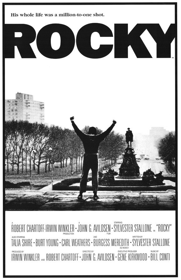
R&P Rocky Poster Analysis


The Rocky poster features the main character " Rocky Balboa" in one of the most icon moments in the film, where he is standing on the top of the stair that he has just run up with his hands in the air. Even though the poster would have been released before the film, and the audience would not know what this scene is, it is still a good image that represents triumph and glory, of which the film is all about.

The poster is in black and white, even though the film is in colour. This may have been done to conform to the time era of which the film is set, the black and white also gives the poster a retro feel. The black and white design is also different to most of the other poster of the time and would have helped to make the rocky poster unique and eye catching, which would help to attract an audience.

Just from looking at the poster, it is hard to identify the genre of the film, there are no tell tale signs that give away the genre like in many other posters, but i guess that by making the genre hard to identify, it makes the audience more curious as to what the film is about.

The main title of the film is located at the top of the page along with a small slogan. The font of the title is very plain and the text is in bold black. The contrast between the font colour and the background colour really makes the title stand out and gives it a real in your face feel, which is good as it attracts the audiences attention.

The film is set in downtown Philadelphia in 1975 and in the background of the poster, you can see the city streets of downtown with the furthest buildings fading away into the distance, in the foreground, you can see the main character with his back facing the camera, which helps to keep the audience guessing who the main character is played by, that is until they look at the bottom of the poster where the credits are located.

Finally at the bottom of the page we can see the credit information. This section of the poster is separated from the rest of the poster by a dividing line where the picture and the credit information are split, this helps the audience to differentiate between the picture and the credits as well as making the credits clearer. The credits are surprising large for a poster, especially compared to more modern posters, some may argue that having large credits is a good thing, others would argue that they are a bad thing and that the ruin the look of a poster. What is strange about this poster is that there are no dates on the poster, i assume that this poster is a marketing poster released before the date of the film was finalized.

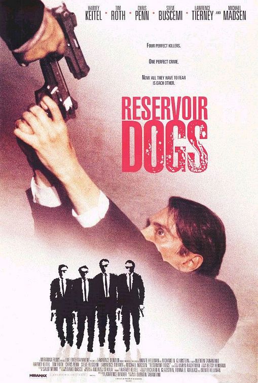
R&P Reservoir Dogs Poster Analysis


The poster for reservoir dogs features a character in the middle of the poster with a gun being pointed at his head

The characters themselves can been see wearing black suits, in fact they are all wearing the same suitm, which could mean that they belong to some sort of organisation. The black suit is also something commonly found in gangster films. The suits that the characters are wearing not only stand out from the white background, but they also provide the audience with an insight into what the genre of the film could be.

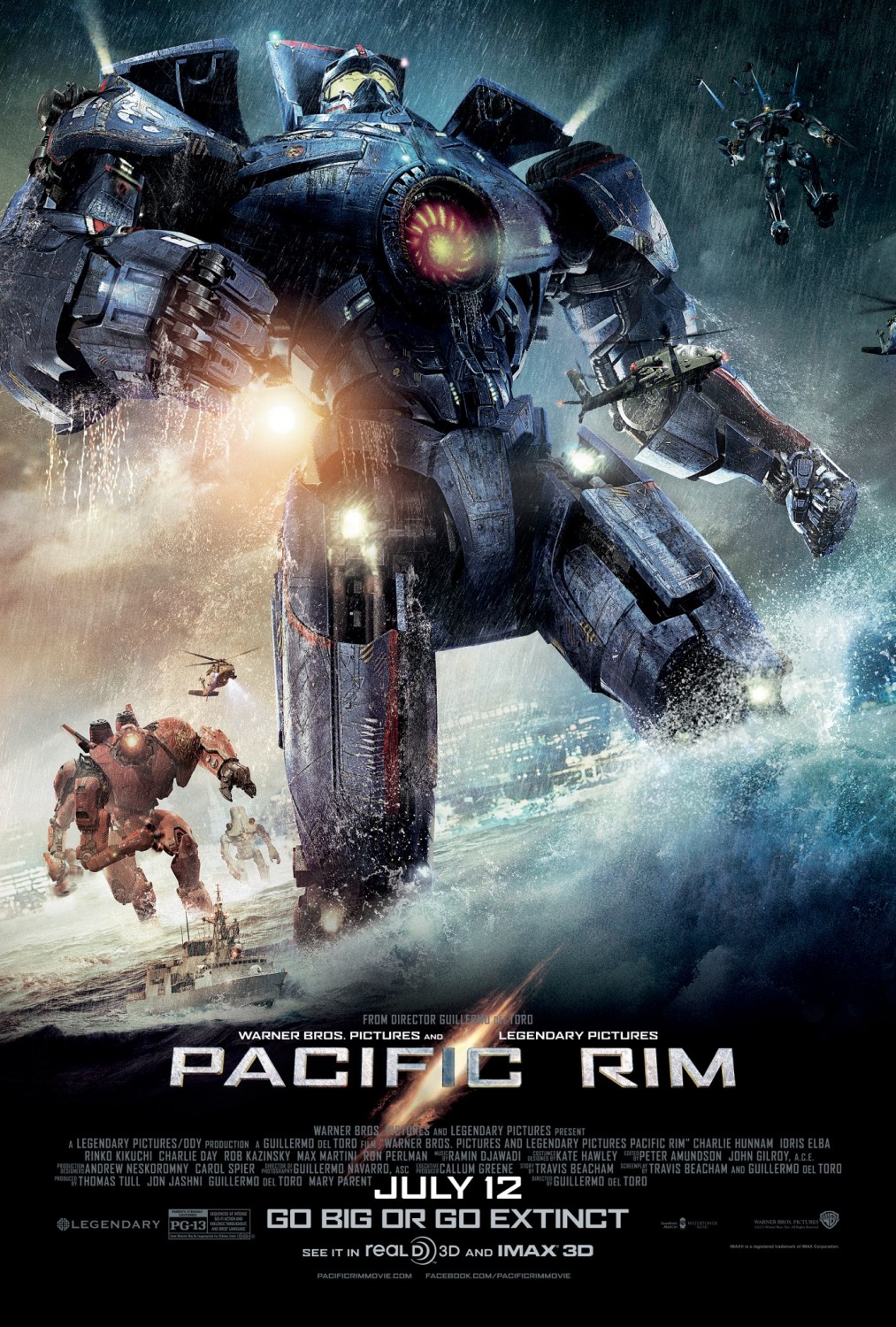
R&P Pacific Rim Poster Analysis

Extra Large Movie Poster Image for Pacific Rim

The poster features the main Jager from the film, "Gypsy Danger" in the middle of the poster, with some of the other Jager's in the background of the poster. The main "character" in stading in water with a big wave crashing up against their leg.

The poster has a lot of bold colours of which are really eye catching to the audience. The poster has obviously been designed to show off the incredible CGI used in the film, and it has done that. The unique selling point of the film is the CGI that is used in it, and by using the CGI images in the poster it not only makes the unique selling point of the film obvious, but it also makes the poster more appealing to a wider audiences.

From looking at the poster, the genre is obviously action. The massive robots and the helicopters in the background give the poster a military feel, even though there is no direct references to the military, such as army soldiers, tanks, or missiles and jets. Action is a really popular genre of film and is bound to attract a big audience.

The main title of the film is located at the bottom of the page and is presented in capitals throughout the title. The title is in a white/silver colour and really stands out from the dark blue/black background it is up against. This helps to make the title of the film really stand out to the audience and will be the second thing that there attention is focused on after the main image in the middle of the poster. The contrast of colours between the title and the background really make the title visible. Just behind the title text is an orange "tear" in the page, which may have something to do with the plot of the film. Whether that tear is there for a plot reason or just to make the title look better, it does make the title look better non the less, which also helps to make the poster look more attractive to the audience.

At the bottom of the poster we can see the institutional information and the release date. The release date is in a white text which helps it to stand out from the dark coloured image behind it. This means that the release date of the film is really clear to the audience, hopefully making them more likely to go and see the film at the cinema. The institutional information however is really small and in a darker colour font making it blend into the background image a lot. This is most likely done because the audience does not really care about the company that makes the film, as long is the film is good, so by making that information smaller and blend into the poster more, they can make the poster look more clean and give the audience the information that they want, whilst still giving credit to the people that worked hard on making the film.

R&P Django Unchained Poster Analysis


The poster features the main character of the film, "Django" in the middle of the poster, with the other main character to the left and right of him.

The poster has an interesting design, with the characters being in black and white, and the rest of the poster in colour, mostly red however. This has the effect of making the titles stand out, rather than the character in the poster, however the characters in the middle of the poster are still the center of attention. The character being in black and white may also give the audience an idea of the time era the film is set in. The blood that is splattered behind the main character but in front of the other characters is in colour unlike the actual characters. This helps to attract the audiences attention as well as give an indication of the genre of the film and what the film will include, but after seeing that it is directed by Tarantino, you can be sure that there will be lots of blood and violence.

The characters are wearing really stereotypical western/cowboy costumes and are holding a revolver, as well as sporting cowboy hats. Not only does this make the poster more appealing to the audience, it also helps to identify the genre of the film.

The film is obviously a spaghetti western, the poster just screams it, everything from the characters and what they are wearing, to the art style and the blood all over the place is a clear indication of the genre.

The title of the film is located just down from the center of the page and is in a western style font and is in a bright red colour. The title is very eye catching, especially up against the black and white image of the characters, one could even say that it is more eye catching than the image of the characters themeselves, which is strange for a film poster. The main title of the film is not the only text that is visible on the page, there is also the credits for the actors that are located above the main film title almost in the middle of the page; which are writen in the same style as the main title text but in a white colour, as well as the credit for the director, Tarantino. There is also some text under the main film title with is mostly comprised of the institutional information. The information, other that a few other actor credits, which are white, just like the other actor credits, are in a grey colour. This enables the designers of the poster to make that information blend into the page, the same thing that is done in most other film posters. The audience does not want to see the institutional information, so why should they, so that information is hidden at the bottom of the page in a font and colour that is not bold or eye catching. Lastly, at the bottom of the page we can see the release date information, which is in the same colour and font as the title of the film only smaller. This helps to make it stand out and give the audience the information that they want.

R&P World War Z Poster analysis

Saturday 17 August 2013

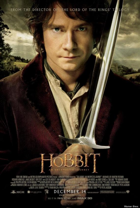
R&P "The Hobbit" Poster analysis


The poster "The Hobbit" features the main character of the film, Bilbo Baggins played by Martin Freeman. This is a different advertising approach to the Empire magazine cover as the poster features an actor that was not in the Lord of the Rings trilogy of film, this might mean that the average film watcher may not know who the character featured in the poster is, however the art style and the colours in the featured image are highly similar to the art style used in the original three films, with the colours on the character in the foreground being very bold and the overall contrast of the image being very high, and the background colours being very washed out and aged looking, this makes the character in the foreground stand out and making it the first thing the viewer looks at. The character himself is holding a sword, indicating to the viewer of the poster that the film is set in a time before guns and bombs, aka middle earth where the film is set.

The next thing that the audiences eye is drawn to is the "The Hobbit" title placed in the middle of the page close to the bottom of the poster. The title is in the same colour and font as the original three films, which means that people that have seen the other three films will know that the film is part of the series. The other reason why the title is effective is because it is eye catching, it is the second thing the audiences attention is drawn to after the main image, which is obviously intentionally done by the studio.

In the background of the image you scan see that there is a visible reference to the setting of the film, which is one of the USP of the film. it is filmed in the hills of the New Zealand and is has some of the best scenery seen on modern films. The landscape is visible in the background behind the main character depicted in the foreground. You can see the light beams going though the clouds onto the ground behind the main character.

The industry information at the bottom of the page is in a white text against a mostly black background. This helps to make the text visible, but not intrusive.

Wednesday 17 July 2013

R&P This Is The End trailer analysis


The film is directed by Seth Rogen and Evan Goldberg and features actors such as James Franco Seth Rogan and cameos from Emma Watson, Channing Tatum and Rihanna. This helps to attract an audience from fans of those actors and the directors, as well as people that like comedy films.

The plot is based around the end of the world events and the main characters have to barricade themselves inside of a house to survive, with only a few bottles of water, lots of beer and a few food items. This is a typical setting for a horror/action/syfi/comedy film. The breaking of the equilbrium is the end of the world event, and even though the trailer does not explicity sayit, but one would assume that the main characters have to save the world. The narative theroy that the film confoms closest to is Todorov's theory. The start shows a stalbe state of equlibrium and then the equlibrium is disrupted and the characters have to survive, as well as restore the equlibrium. The film does not conform to propps theroy as it has no defined hero, villan or any of the roles, its almost like all of the main characters play the heros and a few of the other character types come and go briefly.

The rest of the setting starts of with a house party setting, with all of the character enjoying themselves, then the setting sudendly changes to a fire ridden apocylisps setting. The contrast between the two settings amplifies the main setting which is the apocalyptic setting. This makes the audience see that the events happening are, well, "serious".
The sound that is in the trailer has a background rap track the plays almost thoughout the entirety of the trailer. The track at the beggining helps to make the begginging of the film seem very light hearted and easy going, but the track continues over to the second setting of the trailer, which helps to keep the audience in the mid set of that this film is a comedy and not as serious action film. The dialouge in the film is small snippets of the film, which help to give the audience a small outlibne opf the plot of the film, buit not give it away completely.

The costumes which the characters are wearing in the film are very typical of average american people, as the film is based around the actors playing themselves. The setting is typical is said before and every thing else is very typical of a modern American film.

The camera angles that are used in the trailer are fairly simple as well. As there is not really any complicated fight or chase scenes, the camera angles can be kept simple and the match on action is limited to talking scenes. A more wide vairity of camera angles woulf have made the film more technically impressive, but the whole poimnt of a comedy is to entertain, and making it more technically impressive would not have added entertainment value, therfore making it pointless.

Tuesday 16 July 2013

R&P Skyfall Poster analysis


The main selling point of the film which is utilized in the poster is James Bond franshise. The main charcter, James Bond played by Daniel Craig, is the centre of attention in the centre of the poster. Another icon feature of the franshise is the Aston Martin, which is also pictured in the poster. The last iconic feature in the poster is Big Ben in the background. The poster utilses the icon features of the franshise to help attract an audience that are fans of the franshise or like the idea of a action spy hero, which he is identifed by the clothes he is wearing, the typical spy uniform.

The colour of the poster help the audience identify that the film is set in the past. The poster is in a monochrome black and white, which is not just eye catching, but is also a time period indicator. The colour of the poster also helps to make it stand out from the crowd, adding to the films sell-ability.

The genre is subtly conveyed using the franchise and the addition of the gun that he is holding. The James Bond line of films is notorious for its action genre, the the addition of the gun in the poster helps people that have not seen the films before Skyfall. This poster helps to make the film appeal to those that are a fan of the franchise, and those that are not.

The Font that is used in the title of the is relatively plain and the colour of the poster; the black and white theme. This makes the title eye catching, but does not steal the entire poster. This is done so that first thing that the audience look at is the image of James Bond, then their attention is turned to the name of the film.

At the bottom of the poster is the institutional information. This information is located at the bottom of the poster because, simply, it is not eye catching and nobody really wants to see it, however, the information needs to be on the poster to advertise the


FONT
USP
INSTITUTIONAL INFO
GENRE
IMAGE
COLOUR

Monday 15 July 2013

R&P Django Unchained trailer analysis


One of the main selling points of the film is the director, Quentin Tarantino, who has directed other films such as Pulp fiction and Reservoir Dogs.Tarantino has a very specific style that carries over thoughout all of his films. This style of his appeals to many audiences, which means that fans of his other films, will want to go and see Django. Tarantino's style glorifies violence which makes many of his films controversial but they still appeal to a large audience.

The film is not a conventional western film, there is no dedicated hero and the hero's "sidekick" is not conventional at all and has a huge role to play in the film. The sidekick in the film is actually a bounty hunter and saves the hero at the beggining of the film, and plays a major role in the rest of the film. Django is not a conventional