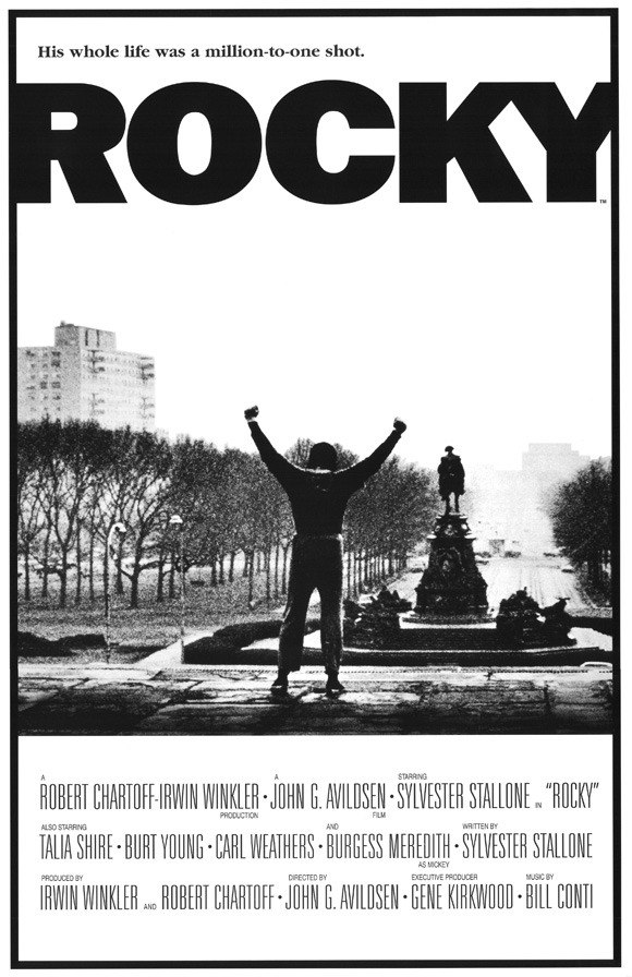
The Rocky poster features the main character " Rocky Balboa" in one of the most icon moments in the film, where he is standing on the top of the stair that he has just run up with his hands in the air. Even though the poster would have been released before the film, and the audience would not know what this scene is, it is still a good image that represents triumph and glory, of which the film is all about.
The poster is in black and white, even though the film is in colour. This may have been done to conform to the time era of which the film is set, the black and white also gives the poster a retro feel. The black and white design is also different to most of the other poster of the time and would have helped to make the rocky poster unique and eye catching, which would help to attract an audience.
Just from looking at the poster, it is hard to identify the genre of the film, there are no tell tale signs that give away the genre like in many other posters, but i guess that by making the genre hard to identify, it makes the audience more curious as to what the film is about.
The main title of the film is located at the top of the page along with a small slogan. The font of the title is very plain and the text is in bold black. The contrast between the font colour and the background colour really makes the title stand out and gives it a real in your face feel, which is good as it attracts the audiences attention.
The film is set in downtown Philadelphia in 1975 and in the background of the poster, you can see the city streets of downtown with the furthest buildings fading away into the distance, in the foreground, you can see the main character with his back facing the camera, which helps to keep the audience guessing who the main character is played by, that is until they look at the bottom of the poster where the credits are located.
Finally at the bottom of the page we can see the credit information. This section of the poster is separated from the rest of the poster by a dividing line where the picture and the credit information are split, this helps the audience to differentiate between the picture and the credits as well as making the credits clearer. The credits are surprising large for a poster, especially compared to more modern posters, some may argue that having large credits is a good thing, others would argue that they are a bad thing and that the ruin the look of a poster. What is strange about this poster is that there are no dates on the poster, i assume that this poster is a marketing poster released before the date of the film was finalized.
No comments:
Post a Comment